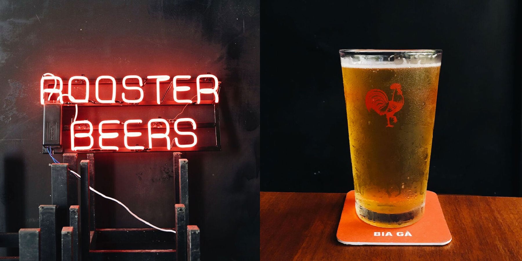
Although the expansion of the Vietnam craft beer industry is changing the face of the country’s drinking culture, many brands still cling to western concepts. What constitutes a truly Vietnamese craft beer is yet to be defined. So, building a brand identity that everyone can relate to has proven to be a true challenge.
While some breweries embrace western-style approaches to strategy and branding, there are others, like Rooster Beers, who have rebranded and shifted their marketing and branding campaigns to better align with Vietnamese culture. For Rooster Beers, what started out as a brand imbued with lots of western humor, has become one with a localized approach to introducing craft beer to Vietnam. One major component of this is the need for a dual language approach—an asset that’s helping Rooster Beers resonate more with Vietnamese consumers.
In order to understand more about Roosters Beers’ redirection, we sat down with their team and their rebranding partners, Rice Creative, to dig deeper into their anti-craft, craft beer brand, as well as the philosophy that helps them keep their brews classic, simple, and clean—and made with the highest quality ingredients possible.

Vietnam craft beer: Rebranding for the local market
Starting from the beginning
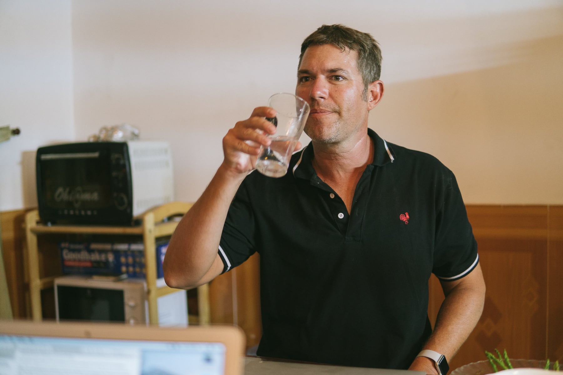
Michael Sakkers, Rooster Beers’ co-owner and CEO took us back to the very beginning: “I started out selling my beer at Sanchos on Bui Vien, but it didn’t even have a name yet,” Michael opens with a laugh. It was an unexpected call from BiaCraft’s co-founder Tim Scott that convinced Michael to start a proper company and get a logo for his craft beer.
“At the time, I was living in Can Gio with roosters running around everywhere. I didn’t know the national bird of Vietnam but it certainly should be a rooster, and that sparked a thought. I like to keep things funny so the first name I came up with was “Phat Rooster,” Michael remembers.
The wake-up call
“I took Tim’s advice and began thinking more about branding. I typed in ‘rooster logo’ on Google and found some images and slapped them together myself. Then things picked up so fast I never had the time to go back and change it. Later, I found out that logo I’d used was from a Western European football team, and I realized it had to be changed.”
The next step was to find someone to create a proper logo. “I found a graphic designer based out of London to help me come up with something original. The first logo was this stylized angry rooster. I knew nothing about branding at that time, but understood we eventually had to rethink our strategy and image.”

Refining the vision
“Our sole investor, directed us towards Rice Creative. They were the new agency in town and everyone was a fan of the work they did for Marou Chocolate, so we scheduled a meeting,” explains Michael.
“I’m extremely passionate about the philosophy behind my beer. We only use the highest-quality ingredients but make it a point to keep our prices low.” Because of that, Michael’s philosophy around Vietnam craft beer is different than most other breweries in town. “My vision isn’t the same. I want to keep things simple. All I care about is making classic, excellent quality craft beer,”
In the beginning Rice Creative was apprehensive of the project, but soon saw that Michael and his team were out for something different than the other Vietnam craft beer companies in the market. “We think of ourselves as an anti-craft, craft beer brand, and Rice quickly got it and took it to a whole new level.” Reflects Michael.
Finding a new concept
Mark Bain is the design director for Rice Creative and worked to make Michael’s vision become a reality. Rooster Beers is about making mileage beer that is easy to drink, timeless, and universal. “Because of that, I refer to their concept as “normcore” Bain explains.
Although the brand already had its own ethos there wasn’t a clear focus yet. “Basically, Rice stalked me for three months picking my brain. They even spent a night at the brewery, we hung out and I kept explaining my vision and how we were separate from the rest of the pack,” Michael says.
Gradually Rice Creative connected with the concept of simple, quality Vietnam craft beer. “From the beginning Michael bluntly stated that his craft beer was very traditional. That meant no adjuncts or obnoxious complexity. It is straight to the point,” Bain explains.
The irony in that is Michael is also the producer for most BiaCraft beers. If you know their beers, you’ll understand Michael has also been making distinctly complex, fruity beers for BiaCraft. “Considering the simplicity of Rooster Beers, most people would be surprised to learn that I’m also the main contractor for BiaCraft,” Michael shrugs. “It’s a funny thing being adamantly opposed to fruit in beer but making the best fruit beers in town, try Bia Craft’s Berry Wit, and you will see what I mean.”

Becoming a Vietnam craft beer brand
“From the beginning Rooster Beers had this populist mindset. Vietnam loves to party on the street. When you drive around and see a big group of people sitting on little plastic stools there’s often a pile of empty cans under the table. As I understood the vision, it became clear that Rooster wanted those cans to be theirs. That is what really turned our heads,” Bain shares.
By keeping their craft beer simple and inexpensive, it has potential to become a standard beer for the local market—which is a big step away from what most of the breweries are doing in Vietnam. “Considering Vietnamese drinking culture, this philosophy felt appropriate. Rooster Beers was shifting to a more Viet-centric angle, which not a lot of players in the industry were doing,” Bain elaborates.
The first part of the rebranding process included a big audit. “Rice had to persuade me into dropping the word ‘phat’ from the brand because I really wanted to keep an element of humor,” Michael reminisces. Rice presented him with a PowerPoint presentation that said they needed to “cut the fat.” That caught me off guard. But the next slide stated that the word “phat” needed to be cut from the brand name. “Once I saw the second slide I said, ‘damn it!!’” Michael laughs, “but it also made me realize that the brand needed to align more with Vietnamese culture, using English is fine as long as we understand how it is interpreted by our target customer. And ‘Phat’ wasn’t the only thing not cutting it.”

The design philosophy
The new design and typeface are intentionally classic, unlike the first logo which had a stylized look and feel to it. “Looking back, the original felt more like a tattoo,” says Michael. At that time, Rice wasn’t so critical of the logo as they were more concerned about changing the brand name. Once that was agreed upon, reconfiguring the design and coming up with some attractive merchandise was next on the list. They released coasters, raincoats, hats, and T-shirts, all in dual language to help represent the ethos of the brand.
“The new brand needed to have longevity. We wanted something that looked like it could have already been around for twenty years. This fit with our philosophy of aspiring towards a classic look and feel,” Bain explains.
“We looked at Rooster’s competitors and thought it was strange other brands were using ‘Hollywoodization’ to sell craft beer in Vietnam. It wasn’t relevant. We wanted to get away from ‘craft.’ Our solution was to embrace conventions from classic beer designs like Budweiser. It’s symmetrical and iconic, and that’s when we started referring to it as ‘normcore,’” Bain says.
It’s common for graphic designers to receive criticism when a font or typeface forgoes the flashiness for something more traditional. “But that’s the typeface we wanted. It’s beautifully straightforward and intentionally generic. It’s not exclusive and it sticks with you. Going classic was a calculated move,” says Bain.
But the final logo for Rooster Beers took months to develop. Although Rice Creative ultimately designed it, Michael even had his mother draw up a few sketches to see whether she could come up with something generic for the logo to match the typeface.
“I didn’t want my mom to actually make the logo but it was great input. It was extremely challenging since it had to be generic enough that it wasn’t stylized. It needed to be serious and have attitude, without being emblematic of anything too western,” Michael nods.

The future for Rooster Beers
Now, Rooster are hoping to make a big impact on the local market. The Rice Creative rebranded cans of Rooster Beer will hopefully be all over Saigon. “Right now we’re just beginning our journey into local expansion. We want every street vendor in the city to be selling our cans and I’m confident we will succeed,” Michael concludes with a smile.
Related Content:
[Article] Craft Beer In Vietnam: A Guide To Vietnamese Artisanal Brew
[Video] The Steady Modernization Of Vietnamese Brands
