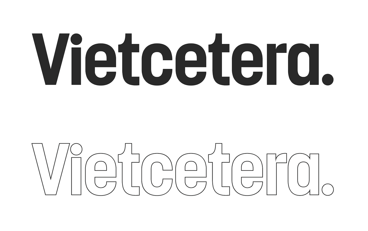
Vietcetera has evolved from an online editorial platform to a multimedia content platform. We started with a goal to bring print-quality writing and visuals online. Our scope is wider and deeper than that now. While we continue to be known for millennial storytelling, we do it now with video, co-branded initiatives, offline events, and more.
Vietcetera has grown quickly in the last three years, starting first as a side project amongst friends for the first year, later becoming a business that would see the team grow from 3 to 30. The team has projects in the pipeline that will test the limits of the existing branding system. We thought it was important to set the stage for the team to do bigger, better things. It was also time to clean house of the last-minute sub-brands and random logos.
Three years ago, in keeping with our aim to bring print-quality writing and visuals online, we borrowed heavily from the design language of magazines. It did its job to lend credibility to what was essentially an online blog. But now it’s just not flexible enough to look great on films, next to sponsor logos, in animation, or as an icon on Vietnam’s increasingly mobile-focused audience.

We looked at the brands we aspire to be, like Vice, Vox, The New York Times, and Monocle. They each have a system that we drew inspiration from. We also looked at local publishers, regional peers, and other global references. Our creative checklist for the new branding system became focused on five questions:
1. Is it visually impactful?
2. Does it communicate an insightful understanding of the topic?
3. Is it viewable on small screens and print?
4. Does it look good over film footage?
5. Can it be animated?

Yes. Vietcetera’s new logo can be animated.
We had to keep the name of course. We were also fond of the “V” and “...” iconography.
The icon is recognizable but feels imbalanced when standing on its own. So we redesigned it. The typeface feels dated and it doesn’t look great on a small screen. All the sub-brands that we derived last-minute from the old branding system had to change.
We want to balance keywords in the Vietcetera identity such as “Impact” and “Insights”, “Global” and “Local”.

We want something that stops you as you scroll your feed or as a video autoplays. We want a brand that is confident and timeless, one where we don’t need print design language to show that we have print-quality content. Our other intention was to stand side by side with global brands, and borrow a bit of local design language to hint at our roots.

We hope the current Vietcetera readers will see a noticeable facelift. For new Vietcetera readers, it should feel natural at each touchpoint of our multimedia content platform. And just as important, we want the content creators of Vietcetera to leverage a clearer branding system to continue building a platform and voice for the new generations of Vietnam.
